13 Garden centre website standards
You might think every website should be different and unique but behind the design of websites lies a world of standards, common practices and assumptions that are vital for customers. Have you ever seen a website with a company logo on the bottom? Or a product filter underneath products instead of above them?
These are web design standards everyone agrees on.
At Garden Connect, we want to make sure every website is unique. That’s why our designers make all designs from scratch and are not allowed to use templates. But why do many websites of garden centres still feel the same? We did a survey of 48 garden centre websites including 4 of our own customers to illustrate.
Based on this survey, we want to share 13 garden centre website standards with you, all used by the top brands in the garden industry.
1. Logo on the left top corner
40 out of the 48 websites we visited have a logo on the top left corner. That didn’t surprise us at all since it’s the most common web design standard out there. The logo is the anchor point for many visitors and everyone knows the logo links back to the homepage. That’s why you rarely see a “Home” button on websites nowadays.
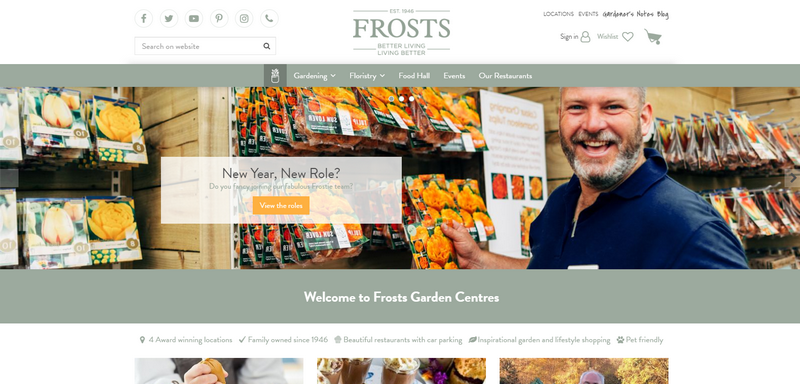
Only a few websites choose to have the logo in the middle (mostly to conform to their branding handbook and shop identity). Not one had their logo on the right. Frosts are an exception on this rule for example:
2. Utilities in the right top corner
If the logo is on the left, the “utilities” should be on the right. Utilities are functional items like a shopping cart, contact info, loyalty card login and opening hours. It’s everything you might need but which is not inspiring.
Out of the 48 websites, 28 had contact info on the right top corner of their website like a phone number or link to an email form. Like the logo, contact details have a standard position on a website.
Among the websites we visited are groups like Squires and Blue Diamond who can’t publish all opening hours and contact details on the right top corner due to having more then one centre. Most of them had an option “Locations” available, which gives access to the opening hours.
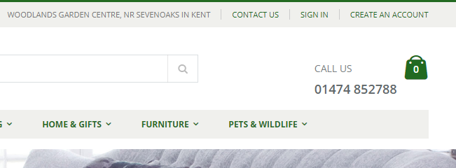
For example, Woodlands Garden Centre has a phone number and direct link to the contact page on the right top, as well as other utilities.
3. Horizontal menu
When we started building websites for garden centres in 2002, every menu was vertical on the left side of the screen.
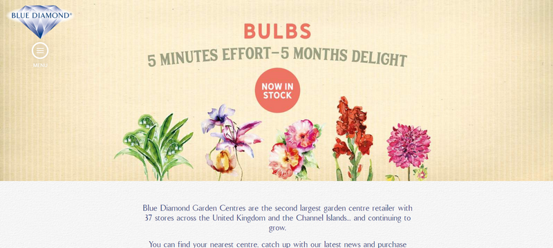
Fast forward to 2020: only 2 of the 48 websites we’ve visited had a menu on the left. All other websites had a menu at the top. One of those two had the famous hamburger-menu (Blue Diamond) which is normally only used on mobile.
Having a horizontal menu offers lots of benefits since you can expand those menus to give access to deeper sections of the website.
4. USP’s on top of the website
Everyone knows what you sell but why should they visit your garden centre? What makes you unique? Having USP’s on your website helps you to make clear why visitors should shop at your garden centre.
Surprisingly, only 18 of the 48 websites we visited had USP’s on top of their homepage.
While many webshops use USP’s to communicate important information (E.g. Free delivery from £25, 30-day return period), brick & mortar stores can adapt the same tactics (E.g. Since 1931, Own nursery).
It’s not enough to tell what you have, you should give visitors reasons to visit you.
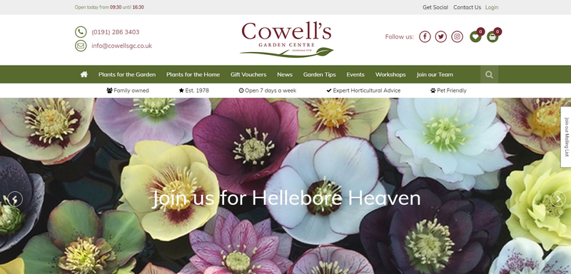
Cowell’s has positioned the USP’s directly under the menu, easy to find for everyone.
5. Slideshow on homepage
Another common practice is the homepage slideshow. 27 of the 48 garden centres we visited had a big slideshow on their homepage.
Images are very powerful and as they say, worth more than 1000 words.
Make sure to balance words and images on your website. Give your visitors enough to be inspired by but also give Google enough text to rank you well on your most important keywords.
Big slideshows are very effective on desktop but we do not recommend them on mobile due to space limitations. We don’t want customers to only see a slideshow and nothing else.
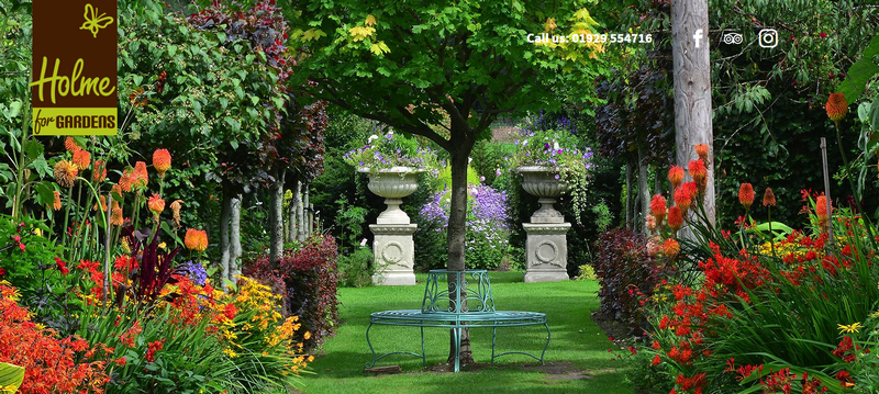
Holme for Gardens makes a strong statement with their full-screen opening photo.
6. A search bar on top of the website
You can have the best navigation menu in the world, yet many visitors go straight to the search box on your website. 42 of the 48 websites we included have a search box at the top of their website, mostly above the main menu.
We recommend everyone to consider having a search box at the top of the website. It is something many visitors have come to expect as it’s a well-known web design standard. It's hard to ignore this one.
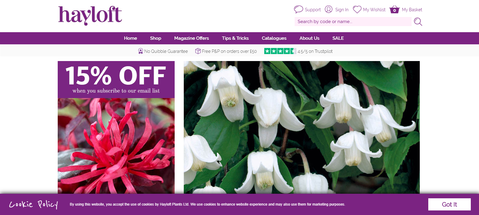
Hayloft has the search bar in the top right, straight under the utilities. A bit clunky but the location is perfect.
7. Newsletter subscription on the homepage
Email marketing is still one of the most powerful options you have at your disposal. You’re not relying on third parties like Facebook or Twitter, it’s easy to do, powerful and you can easily measure the results.
Despite all those benefits, only 16 of the 48 garden centres offer an email sign-up form on their homepage. We think this is a missed opportunity for the 32 garden centres who are not tapping into this potential.
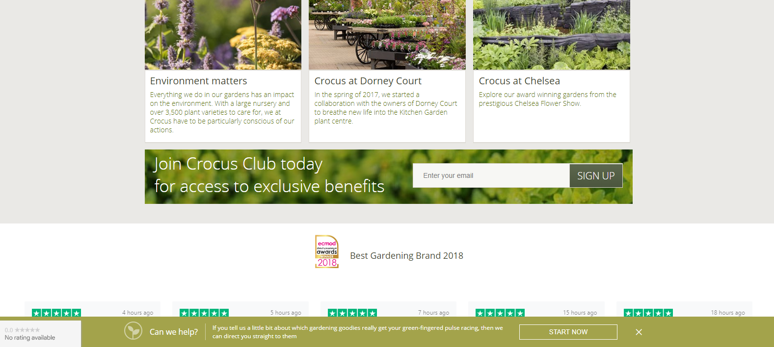
Crocus is doing a good job with their email sign up. It’s not GDPR compliant, but it looks good and the spot, on the bottom of the homepage, is perfect. (To make it GDPR compliant they would need to mention the frequency and need to link to the privacy policy).
8. Social media icons in the header
Among the websites we’ve visited, 16 of them had links to social media channels at the top of their website. It’s common to do this but we are not entirely convinced by this practice.
It costs a lot of time and money to get visitors on your website. If you offer an exit to a platform like Facebook, it’s likely visitors won’t come back to your website at all and forget about your brand instantly. Facebook is full of distractions after all.
Our recommendation is to have modest links to social media, in grayscale, in the footer of your website. We noticed 30 of the 48 centres we looked up are doing it exactly this way.
After all, we are not looking to guide customers to a place where they can easily find competitors!
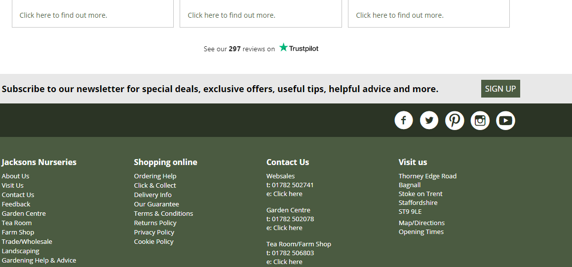
Jackson Nurseries is keeping to the standard: smart links at the bottom, not too obvious but if you’re looking for them you can find them.
9. Selling online
31 out of the 48 garden centres offer a way of online shopping, that’s about 65%. Since we looked at many of the larger brands in the industry we’re not surprised to learn this figure is higher than average (which is about 35%).
It’s a confirmation the big and successful names in the industry are offering their customers an extra service via their webshop. Why wouldn’t you follow them?
We haven’t looked up if the other 35% are selling solely on eBay or Amazon but if they would, it would be a short-sighted strategy. Relying purely on platforms like eBay and Amazon means you are very dependent on the whims of gigantic companies. What if they add a competitor, sell your stuff themselves or change the commission you have to pay?
eBay and Amazon are an extra channel. Your main channel should be your own webshop.
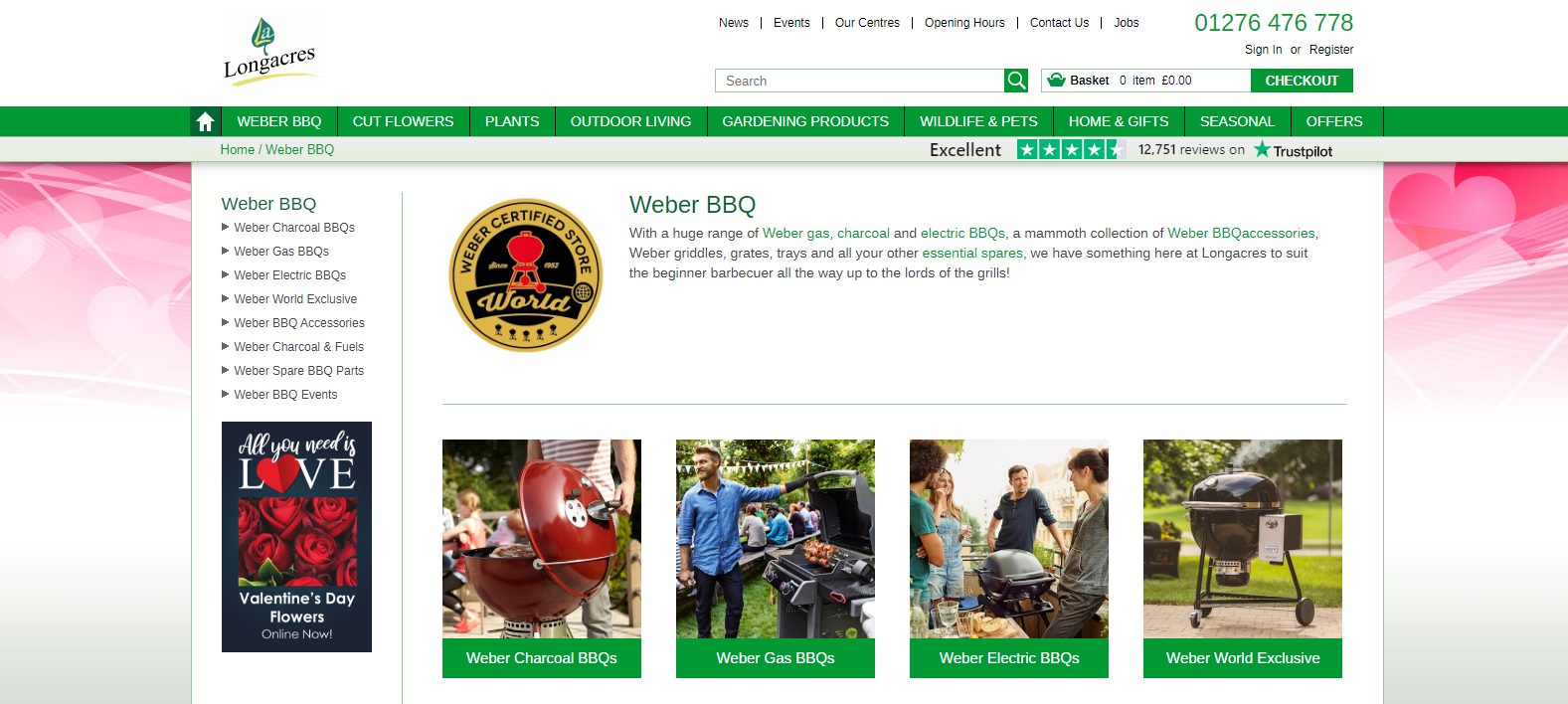
Longacres is offering a wide range of Weber BBQ’s. Manageable for the biggest garden centre of the UK but a complicated product group to start with if you’re new to e-commerce.
10. Do you sell flowers online?
Many consumers are ordering flowers online, but surprisingly, only 1 webshop we visited was offering cut flowers (Frosts).
Maybe this product group is logistically complex but we know it can work well. It could be we are a bit biased though (Dutch roots and all).
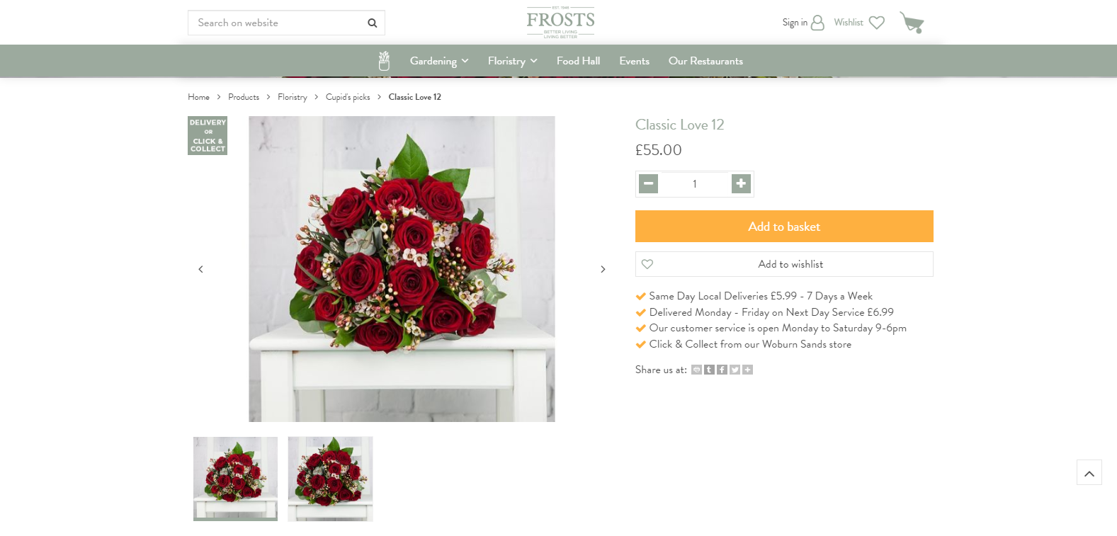
Cupidos’ life made easy: Frosts are the only ones offering fresh flowers for delivery.
11. How about gift vouchers?
Luckily, a lot more garden centres are selling gift vouchers online: 21 out of the 48 are offering gift vouchers in their webshop. We think gift vouchers are a great product. Every voucher sold means you’ll get a new visitor coming to your centre. It’s easy to ship and the average spend can be quite high.
We haven’t come across a UK garden centre who offers a digital gift voucher delivered by e-mail but that might change in 2020. At Garden Connect, we successfully introduced this into many garden centre webshops in the Netherlands in 2019.
By the way, we’re not sure why there are 14 garden centres with a webshop that are not selling gift vouchers: we can only guess about their reasons.
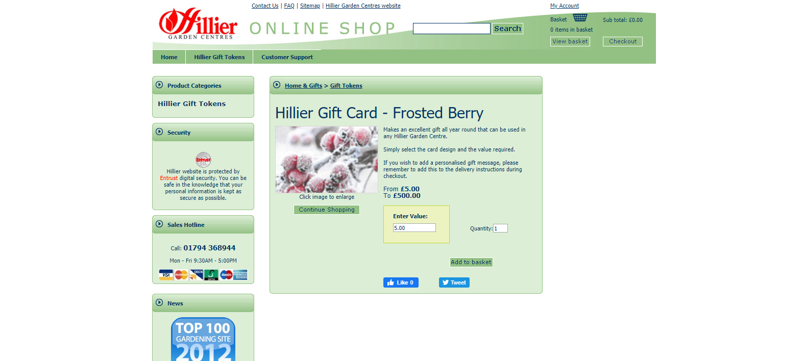
Not sure if we like the look of the webshop, but Hillier is one of the few centres offering themed gift cards. Good idea!
12. Reviews of customers
If you can think you’ve got the best garden centre in the world: you’d better prove it! Having online reviews helps prove your garden centre is top-notch using social evidence. Out of the 48 websites we checked, 33 had reviews on it.
Reviews aren’t limited to a webshop: every garden centre can have reviews on Facebook and Google.
We recommend you actively invite visitors to write reviews. Don’t worry about negative reviews. A business with 300 5-star ratings on Google or Facebook would be a bit suspicious, wouldn’t it?
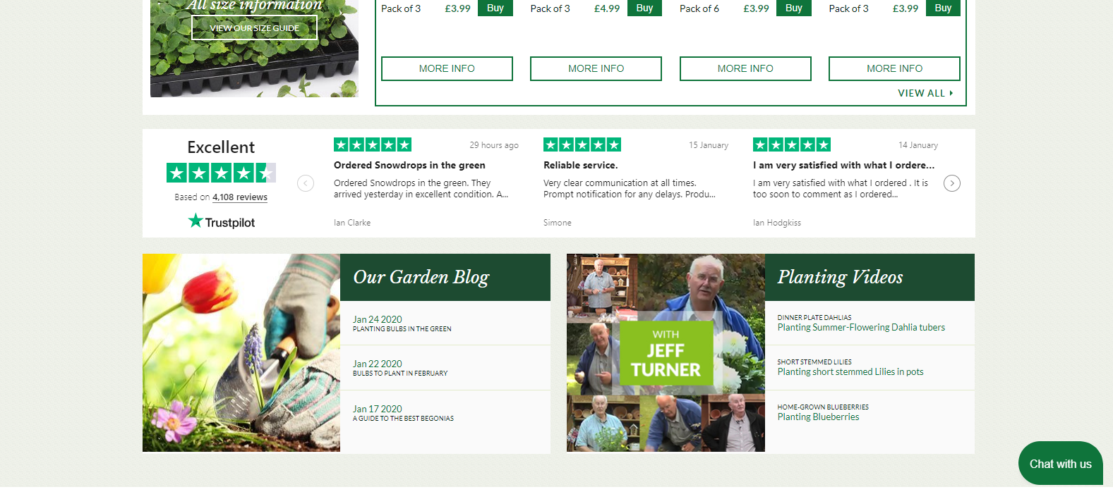
J. Parker’s is showing their Trustpilot reviews in a very prominent way.
13. Live chat
The last point on the list of garden centre website standards is the live chat option. We know it helps to boost online sales so we wanted to know how many garden centres in the UK were offering such a facility.
The answer: 0
Not a single garden centre offers a live chat to customers on its website. We’ve spoken to a few centres who are considering implementing a service like this but no one has taken the step as of yet.

We were a bit disappointed to learn no one is offering a live chat as of yet.
That brings us to the end of the list of website standards in the garden industry. As you see, many websites look the same because they are in some sense the same. But that’s not because designers are lazy or stores are not unique. Many of the websites we’ve checked are designed by top UK marketing agencies and have cost a small fortune.
In 2020, every website has image boxes with text. A slideshow on the front page. A search bar on top of the page.
On top of that, you’re selling the same products at the same time as all of your colleagues and competitors. Bulbs in September. Christmas trees in December. Annuals in April. Your designer (or we!) can’t change that.
Like anything else in life, websites have standards so people understand how to use them. You can try to be headstrong but the major result will be a bunch of confused visitors.
Be creative within the boundaries, your customers will appreciate it.


